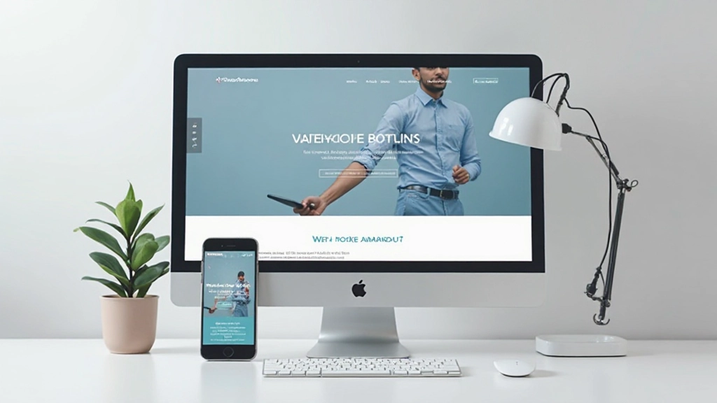
Responsive Design for All Devices
Learn why mobile-friendly design matters and how to create websites that look great on phones, tablets, and computers. It’s simpler than you think.
What Is Responsive Design?
Here’s the reality: people aren’t just browsing websites on desktop computers anymore. Your visitors are checking your site on their phones during lunch breaks, on tablets while relaxing at home, and on massive monitors at work. If your website doesn’t adapt to these different screen sizes, you’re losing potential visitors.
Responsive design is the approach that makes your website automatically adjust its layout, images, and text based on the device viewing it. Instead of creating separate websites for mobile and desktop, you build ONE website that works beautifully everywhere.
The best part? It’s not as complicated as it sounds. With the right fundamentals, you can create responsive websites that impress both users and search engines.


Start Mobile First
The smartest way to build responsive websites is to start with mobile. Design for the smallest screen first — typically around 320-480 pixels wide. Then, as the screen gets larger, you add more features and refine the layout.
Why? Because mobile-first forces you to focus on what’s essential. You can’t clutter the page with unnecessary elements. You have to prioritize content and functionality. When you then expand to larger screens, you’re adding enhancements, not trying to squeeze everything in.
Key Mobile Dimensions
- Small phones: 320-375px wide
- Medium phones: 375-480px wide
- Tablets: 768-1024px wide
- Desktops: 1024px and up
Understanding Breakpoints
Breakpoints are the specific screen widths where your layout changes. They’re like checkpoints in your design where you tell the website “Hey, now that we have more space, let’s rearrange things.”
Most web designers use three main breakpoints. At 768 pixels, you might move from a single column to two columns. At 1024 pixels, you can expand to three columns or add a sidebar. The exact numbers depend on your content and design, but these ranges work for most websites.
You don’t hardcode breakpoints randomly. You should set them where your content naturally needs more space. If your heading looks cramped at 800 pixels, that’s where you add a breakpoint. It’s about making the content comfortable, not following strict rules.

Flexbox: Your Responsive Superpower
If you’re building responsive websites in 2026, you need to know flexbox. It’s the modern CSS layout system that makes responsive design actually easy. Instead of fighting with floats and percentages, flexbox automatically adapts your layout.
Here’s what makes it powerful: you tell flexbox your items should sit in a row, and they do. When the screen gets smaller, you say “switch to column mode,” and they automatically stack. No calculating percentages. No wrestling with widths. Just straightforward, predictable behavior.
You’ll use flexbox for nearly everything: navigation menus, card layouts, hero sections, footers. It’s the foundation of responsive design today. Once you understand flex-direction, gap, and justify-content, you’re basically unstoppable.
Making Images Responsive
Images are often the trickiest part of responsive design. A photo that looks perfect on desktop might be way too large on mobile, wasting data and slowing things down. You need images that are smart about their size.
Three Essential Rules
Always set max-width to 100% so images never break out of their containers
Use height: auto so images scale proportionally without distortion
Consider using modern formats like WebP for faster loading on mobile networks
These three simple practices make the difference between images that enhance your site and images that break it.

Testing Your Responsive Design
Building responsive is only half the battle. You need to actually test it on real devices and different screen sizes. Don’t assume your website looks good just because it works on your computer.
Real Device Testing
Grab an actual smartphone and tablet. View your website on them. How does the text look? Are buttons easy to tap? Does it feel natural?
Browser DevTools
Every modern browser has built-in responsive design tools. Open DevTools (F12), switch to responsive mode, and test different viewport sizes instantly.
Performance Check
Mobile users often have slower connections. Test on 4G or 3G speeds. Is the page loading reasonably fast? Are images optimized?
Touch Interaction
On mobile, people use fingers, not mice. Make sure buttons are big enough to tap accurately (at least 44×44 pixels) and spacing is generous.
Start Building Responsive Today
Responsive design isn’t a luxury anymore — it’s essential. Over 60% of web traffic comes from mobile devices. If your website doesn’t work on phones and tablets, you’re losing visitors, credibility, and opportunities.
The good news? You don’t need to be an expert to build responsive websites. Start with mobile-first thinking. Use flexbox for your layouts. Make images fluid. Test on real devices. These fundamentals will take you incredibly far.
Your next website — whether it’s a portfolio, business site, or blog — should be responsive from day one. Your users will thank you with longer visits, better engagement, and more conversions.
Educational Note
This article provides educational information about responsive web design principles and best practices. The techniques and approaches discussed are intended to help you understand foundational concepts. Web design practices and technology standards evolve continuously. Always verify current best practices with official documentation from organizations like W3C and Mozilla Developer Network before implementing on production websites. Every project has unique requirements that may call for different approaches than those discussed here.