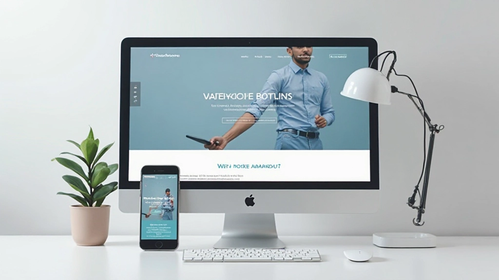
Getting Started With Wireframing
Understand how to plan your website layout before diving into design. Learn simple techniques to sketch out page structure and content flow.
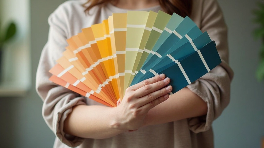
Read articleMaster the fundamentals of pairing colors and fonts that make your website feel cohesive, professional, and visually memorable.

Here’s the thing: your website’s colors and fonts do most of the heavy lifting. Before anyone reads a single word, they’re already forming opinions based on how everything looks. That’s not shallow—it’s just how human brains work.
When you pair colors and typography thoughtfully, visitors feel like your site was designed by professionals. When you don’t, well… it looks like you threw things together on a Monday morning. We’re going to show you how to do it right, so your site feels intentional, trustworthy, and actually pleasant to look at.

You don’t need to be an artist to understand color. Think of it this way: colors have three main jobs on a website. First, they grab attention. Second, they guide visitors’ eyes toward important things—buttons, headings, calls to action. Third, they create a mood.
Start with a primary color. This is your main brand color—maybe a deep blue, warm orange, or forest green. Whatever you choose should feel right for what you’re offering. A wellness site probably won’t use harsh neon red. A tech startup might avoid soft pastels.
Pro tip: Limit yourself to 3-4 colors maximum. One primary color, one secondary, maybe a neutral for backgrounds, and possibly an accent for warnings or special elements. More colors than that and your site starts looking chaotic instead of intentional.
Here’s where a lot of websites go wrong. Designers pick beautiful colors that don’t have enough contrast, and suddenly nobody can read anything. Dark gray text on a light gray background? Looks elegant in your head, but it’s basically illegible.
The rule is simple: make sure your text stands out from its background. Dark text on light backgrounds, or light text on dark backgrounds. That’s it. If you’re unsure, check your contrast ratio using free online tools—you’re aiming for at least 4.5 to 1 for normal text. For headings, you can go a bit lower.
And here’s something people forget: don’t rely on color alone. If you’re using red and green to show success and error messages, you’re leaving colorblind visitors confused. Add icons, text labels, or patterns too. It takes 30 seconds and makes your site actually accessible.
Typography isn’t just picking a pretty font. It’s about creating a system that makes information easy to scan and read. You need a hierarchy—bigger text for headings, smaller for body copy, even smaller for captions.
Pick two fonts maximum. One for headings (maybe something with personality), one for body text (something readable and clean). Sans-serif fonts like Poppins or Open Sans work great for web because they’re crisp and modern. Serif fonts like Georgia can work for body text too, though they’re less common on the web now.

The magic happens when you pair your colors with your typography intentionally. Your primary color should work with your chosen fonts. A bold, geometric sans-serif might pair perfectly with a modern teal. A classic serif font might work better with a sophisticated navy blue.
Think about emotional tone. Bright, energetic colors with modern fonts feel innovative and playful. Muted, earthy colors with traditional fonts feel established and trustworthy. Neither is “better”—it depends on what you’re building.
Also consider your audience. What are they used to seeing in your industry? A law firm website uses different colors and fonts than a creative agency, which uses different ones than a food blog. You’re not breaking rules for the sake of being different—you’re choosing within the context that makes sense for your visitors.
Color and typography aren’t details you figure out last. They’re foundational decisions that shape how people experience your entire website. A thoughtful color palette with solid contrast, paired with a clear typographic hierarchy, transforms a confusing mess into something professional and trustworthy.
Start simple. Pick three colors. Pick two fonts. Make sure everything has good contrast. Test how it looks on different devices. You don’t need to overthink it—just make intentional choices and your site will already look better than 80% of the web.
This article provides educational information about web design fundamentals and color and typography principles. The guidelines and best practices shared here are general recommendations based on widely-accepted design principles. Your specific project may require different approaches based on your audience, industry, and brand identity. Design is subjective, and what works beautifully in one context might not work in another. Use this information as a starting point to inform your own design decisions.